How To Make Your Author Website Look Good
Last week, we spoke about how to build your author website and now it’s time for the fun part. Let’s make your site look pretty!
Are you building your site on Wix? Be sure to also check out my friend Brittany Wang who is the expert on all things Wix!
It can be tempting to dive into picking a template as soon as you’ve set up your hosting and URL, but I would encourage you to first thing about your branding. I know it might not seem like you really need branding as an author, but the key to having a professional looking site is ensuring that all your pages look like they belong with each other and you have a cohesive design that stretches across your social media too. The last thing you want is a homepage with three different script fonts, twelve colours that don’t go well together and lots of random dividers.
Your Brand Style Guide Template
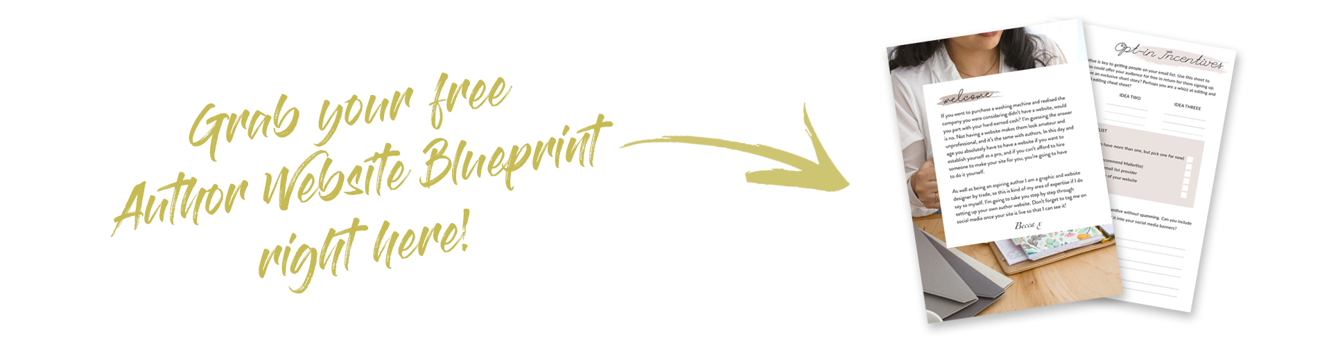
In your Author Website Blueprint (if you haven’t downloaded it yet, what are you waiting for? Grab it by clicking on the image above!) I’ve provided you with a Style Guide Template which you can use to help you figure out your brand. You can edit it using a free online editor like Canva, you can use Photoshop if you have it, or you can even just print it off and stick inspiration pictures to it.
Here is mine as an example:

In the style guide there are spaces for your colours, fonts and any inspiration pics that give off the feel you’re trying to convey with your site. Do you want it to be clean and minimalistic? Do you want it to reflect the genre you write in? If you write children’s books then doodle designs and pastel colours may work well for you, whereas if you write an adult horrors you may want to go for a darker theme.
Don’t pick out too many fonts or colours, as it becomes jarring to the eye and can start to look amateurish. Instead, I recommend opting for one main colour, a couple of complimentary colours and then two fonts maximum. If you’re struggling to pick a colour scheme, Pinterest has loads of gorgeous examples, and you can try out a site like color.com to find colours that go well together.
The key to making your site look professional is consistency. If you’ve used a certain font, size and colour for your heading on the homepage, then you should use that same font, size and colour for every single heading on every single page. The same goes for link colours, buttons, dividers, photo borders etc.
A Quick Note on Logos
While it may be tempting to go out and get a logo designed or to try and design one yourself, logos are not strictly necessary for authors. Just your name and deciding what font, size and colour you want it to be in is sufficient. Of course, if you do want to go and get a fancy logo then go for it!
Picking the Template for your Website
Templates make your site look good, without hiring a designer. Whichever service you used to build your website, you’ll have a library of templates at your fingertips that you can play with and customize. Some are even specifically designed for authors! Just bare in mind that other authors may have used them and so your site may not be as unique as you’d like. Depending on how much time you want to spend fiddling with it, you could try using a template that has been designed for, say, a photographer and then adjusting it to suit your needs.
If you’re using Wix, there is a template library within the builder itself. If you’re on WordPress.org, there are literally thousands of templates, both free and paid, across the internet, so all it requires is a bit of searching. One of my favourite sites to find templates on is themeforest.net.
Note: A lot of people have asked me what template I use. I’m a designer so I designed my template myself using a program called Divi.
Whichever template you use, be sure to look for the word ‘responsive’. A responsive template means that your website will automatically resize and look good when someone is looking at it on their mobile, which, in this day and age, is going to be most people.

Now it’s time to set your choices!
Don’t worry too much about what will actually go on your website (we’ll be covering that next week) but for now I want you to go into your template and set the following:
- Your logo, whether it’s a designed image or simply your name
- The colour of your background. Generally white works well, sometimes black depending on the style of your site. If you’re thinking of using a different colour, I’d suggest using blocks of colour interspersed with blocks of white or black so that it’s easier on the eyes.
- The font, size and colour of your headings and subheadings. Often this will be one of the accent colours that you chose in your style guide.
- The font, size and colour of your body text. If your background is dark, use a light colour, and if your background is light, use a dark colour.
- The colour of your links. These will usually be a different colour to your body text so that they stand out, and again you should use one of the accent colours that you chose in your style guide.
Be sure to download your author website blueprint, and check back next week when we’ll be adding all the elements and pages to your site. My question of the week which I’d love for you to answer in the comments below is… which colour scheme have you chosen for your website and why?